
KYRA is an online store for women’s clothing. Mostly dresses, largely from the JAASE brand: maxi, midi, mini, embroidered, floral, for summer and for winter.
We built her first site a little over a year ago. It had about fifty products. Today it has 189, and 128 of them are dresses.
The site did not break. The store outgrew it.
189products today, 128 of them dresses. The first site had about fifty.
A boutique that no longer fits on one rack
Picture a small boutique. At the start, one rack, fifty pieces. A customer walks in, runs her hand along the hangers and sees everything in two minutes.
Then a new collection arrives. Then another. The rack gets longer, then a second one appears, then a third. The pieces are still lovely, but nobody can find that green midi dress they saw on Instagram anymore.
This is where a good sales assistant comes in. She does not show you the whole shop. She asks “for summer or for autumn?”, “longer or shorter?”, “what size?” and takes you to the right rack.
Sanela put the problem in one sentence: women cannot find a specific dress. This whole project rests on that.
What the store had become in the meantime
The site built for fifty products did what it was built for. It even had seasons on the home page, and filters.
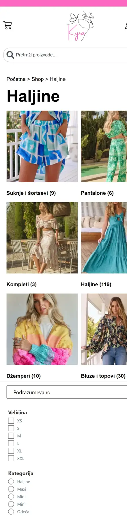
But on a phone, a customer on the Dresses page first saw skirts, trousers and sweaters, then a list of checkboxes for size and category. The first dress sat several screens further down.
All this time Sanela added products and photos herself. That is how it should be. But the photos came straight from a phone or a catalog, so some were as large as 28 MB. (One photo of a dress, as heavy as a short film.)
The hosting plan has 10 GB, and it was almost full.
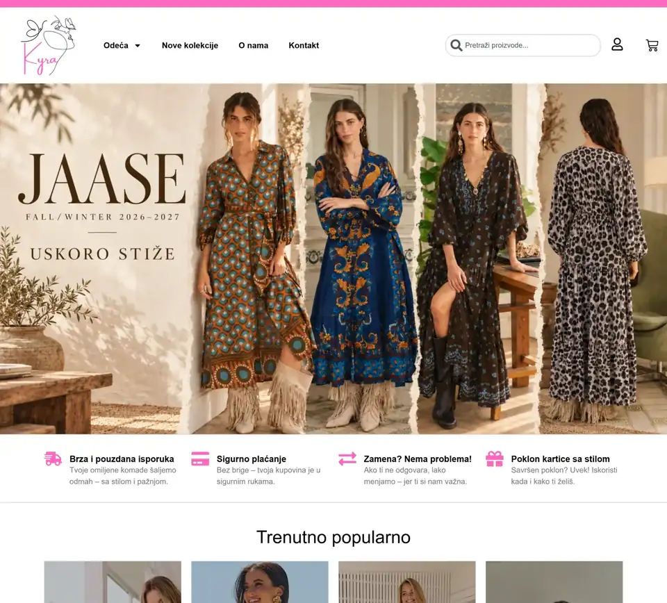
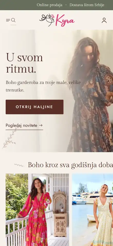
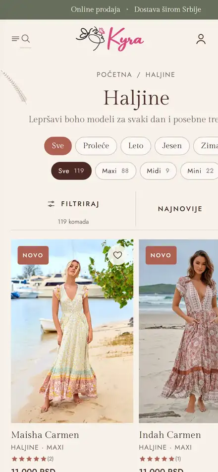
Like a sales assistant who knows where your size hangs
First question: which season. Every piece was already tagged as spring, summer, autumn or winter, and the old home page had tiles for the seasons. Now the seasons are also on the Dresses page itself, as a row of buttons at the top, and they combine with the other filters. The tiles on the home page lead straight to the dresses for that season.
Then: which length. Below the seasons is a row with Maxi, Midi and Mini, with the number of pieces on each button. On the old site this was a small circle in the list of filters.
Then: which size, which price, what is in stock. On a phone these sit in a drawer that opens with the Filter button, so the dresses start right below. Sizes are buttons, not a list of checkboxes.
Search that suggests. When a customer opens search, the most common terms appear under the field: Maxi, Embroidery, Floral print, Blouses. She does not need to know what the dress is called.
Sizes that are out of stock are crossed out. On the product page you see right away what can be ordered. No picking a size only to get an “out of stock” message.
The site talks like Sanela. Almost all customers are women, so the site addresses them in the feminine form, which Serbian makes visible in every sentence, from “Have you shopped with us before?” to greeting her by name in the account. A small thing, but it shows the store was made for them.
Photos without the extra weight. We built a tool that resizes every image to what the site needs, with no visible loss of quality. A 28 MB image is now about 630 KB. The whole site is about 1.5 GB lighter, and every new photo Sanela uploads is resized automatically.
Sanela changes everything herself, without a design tool. Home page text, photos, videos, the size chart, contact details, social links: it is all in one panel in the admin, with plain fields. Products, reviews and categories still go through WooCommerce, as before.
From first look to cart
Once a customer finds a dress, the work is only starting. Here is everything else we refined.
The product on a phone, like a catalog. The photo fills the whole screen and you swipe through it, with dots instead of tiny thumbnails. While the customer reads the description, the “Choose size” bar stays at the bottom of the screen, so she does not have to scroll back up. The size guide is on the product itself, because measurements differ from model to model.
“Recently viewed”. Below the product are the dresses the customer has already opened. Like going back to the rack for one more look at the one from the first round.
A wishlist that is remembered. A heart on every card. The list is tied to the account, so a dress saved on the phone on the bus is waiting on the computer at home.
A cart without wandering. After adding an item, the cart opens at the side and the customer stays on the same page. Cart, checkout and account are in the same style as the rest of the site, not in WooCommerce’s default grey. Creating an account is already offered, for the next purchase.
Dresses in motion. The home page has short videos: three dresses at the top (side by side on a computer, one full screen on a phone), and five clips in the “In the mirror” section that play on tap. The videos are served from a separate video server, so they do not weigh on the store’s hosting.
Latin script everywhere. Serbian WordPress and WooCommerce run in Cyrillic. The site and the admin are now in Latin script, including buttons, messages and country names in the shipping form.
For Google. Every category and page got its own search title and description. Product names written in capital letters in the store now show up in Google in readable form, with the dress length in the name. Old URLs that no longer exist lead to the matching new pages.
For every customer. Colors were darkened where text was not readable enough, and headings and sliders were set up so the site can also be used by someone who listens to it through a screen reader.
Switching over without closing the shop
A store that is open cannot lose a single order.
We built the new site on the side, while the old one kept selling as usual. On switchover day we moved everything that had happened in the meantime and checked it one by one: 339 orders, all 339 in place, with the same amounts and statuses. Customers with accounts, refunds, reviews that came in that same day.
Fiscal receipts are a story of their own. The store issues a receipt when an order is completed, so we made sure no old order got a receipt twice.
The switchover took one evening.
Sales did not drop. In the first 18 days on the new site: 22 orders and 11 new customers.
339orders moved to the new site in one evening, all with the same amounts and statuses.
What you can take for your own store, even without us
Pick up your phone. Think of the product customers ask you about most. Try to find it on your site as a customer who does not know what it is called.
If it takes you more than three taps, it takes the customer more than three taps. And she often gives up sooner.
One more thing: open Media in WordPress and sort by size. If you see photos of 10 MB or more, the site is pushing them to every customer’s phone.
When this makes sense, and when it does not
It makes sense when the store has grown and the site has stayed the same. When customers message you about a product that is already on the site. When you add products without a developer and need a site that can handle it.
It does not make sense if the store has twenty products and customers find them without trouble. Then better photos and clearer descriptions are enough.
If your store has grown and your site has not, see how we build online stores and handle maintenance, or request a quote.
P.S. In short: the first site was built for about fifty products, today there are 189. A customer now picks the season, length and size and gets to the right dress, and Sanela changes everything on the site herself.
P.P.S. We did not invent the most important filter. Sanela had been tagging products with seasons all along. Customers just needed to have those tags where they choose a dress.